Logo
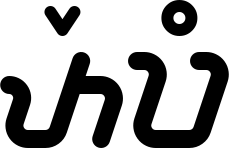
The word patepang in Sundanese script, and the app icon made of its first letter. Which file goes where, and what never to do to it.
The wordmark
#The logo is a word: patepang, written in Sundanese script and read pa · te · pang. Patepang is Sundanese for “meeting each other.”
It has five parts, and each keeps its name inside the files: the letter pa; the letter ta with a pamepet above it, the mark that turns its a into e; and the letter pa again with a panyecek above it, the ring that closes the syllable with ng.
Its shapes are built from recorded geometry, not typed with a font. It is always taken from the files and never set as text.
Its colors
#The logo comes in three colors: soft blue, deep blue and white. The ground and the size decide which.




| Logo | On | When |
|---|---|---|
| Soft blue | Ivory, navy, pale blue | The wordmark is 160 px wide or more. |
| Deep blue | Ivory, white, pale blue | Under 160 px, and in print with one ink. |
| White | Soft blue, deep blue, navy | On soft blue only at large sizes; under them the ground is deep blue or navy, as in the footer of the sites. |
| Soft blue with an apricot panyecek | Ivory, navy | Only in a memory moment. Apricot goes nowhere else. |
In a high-contrast theme the logo is deep blue on light and white on dark.
The logo is never black. The one exception is a process with a single color that cannot be blue, such as newsprint, a stamp or an engraving: then it is full black or full white, never gray.
Which file
#Every shape comes as strokes and as outlines. The strokes are the master; the outlines are the same shapes as filled areas, for tools that handle strokes badly.
| Files | What they are | Use them for |
|---|---|---|
wordmark/patepang-wordmark.svg | The master: strokes that take the color of the text around them (currentColor), with every part named. | The web and the app, the logo’s motion, and changing the panyecek’s color in a memory moment. |
wordmark/patepang-wordmark-putih.svg, -biru-lembut, -biru-dalam, -kenangan | The same strokes with their color set: white, soft blue, deep blue, and the memory variant. | Wherever a file cannot take its color from outside. |
wordmark/outline/ | The same shapes as filled areas, with no strokes and the same names. | Icon generators, favicons, print, embroidery, pins, and any tool that handles strokes badly. |
png/ | PNG copies drawn from the files: the wordmark at four times its size on nothing, the icon at 1024 px. | Where a vector file is not accepted. |
All of them are on Downloads.
Tepang and pa
#Two cuts of the wordmark exist for two narrow jobs.
Tepang is the wordmark without its first pa. It appears only where tepang itself is spoken of, and it never stands in for the wordmark.
The letter pa alone, at the wordmark’s scale, is for small things: stickers, embroidery, pins, key chains.

The app icon
#The app icon is the letter pa, white on soft blue. It is the pa of the wordmark enlarged five and a third times, so its stroke and its bends are the wordmark’s.






| File | For |
|---|---|
ikon/patepang-ikon-1024.svg | A full square without corners: iOS, which rounds it itself; maskable icons of a web app; and the source of every raster copy. |
ikon/patepang-ikon-1024-sudut.svg | Corners of radius 229, which is 22.4%: previews and the web. |
ikon/patepang-ikon-gelap-1024.svg, -sudut | The dark icon: navy with a soft blue pa, with and without corners. |
ikon/patepang-ikon-bulat-1024.svg | A circle: profile pictures. |
ikon/patepang-ikon-glyph-1024.svg | A white pa on nothing: the layer of the iOS tinted mode, and any one-color layer. |
ikon/patepang-favicon.svg | The favicon. Also draw a favicon.ico of 16, 32 and 48 px and a touch icon of 180 px from the master. |
ikon/android/ | Android’s adaptive icon at 108 dp: the soft blue background; the white pa at half the height, inside the 66 dp safe zone; and the one-color layer for themed icons on Android 13 and later. |
Size and clear space
#The wordmark is never narrower than 72 px, dp or pt. In print that is about 20 mm.
Around it, on every side, stays a space as wide as the panyecek: 36 of the wordmark’s units, about 10.5% of its width. Nothing enters it: no words, no edge, no other mark.
What is never done
#Six things that are never done to the logo:
- Redraw it, or type it with a Sundanese-script font. It always comes from the files.
- Use apricot anywhere but the panyecek, or outside a memory moment.
- Let tepang or the letter pa stand in for the wordmark.
What others may and may not do with the name and the logo is in the Intellectual property policy.
How it moves
#The logo moves in two places only: on the splash screen, and at the Connected step of a tempel. It plays once each time and never loops.
The two pa slide in from either side, the ta and its pamepet appear between them, and the panyecek rises last. The whole takes 300 ms.
| Part | Does | Lasts | After | Curve |
|---|---|---|---|---|
| pa1, pa2 | Slide in from 48 units to either side | 240 ms | 0 ms | 0.77, 0, 0.175, 1 |
| ta, pamepet | Appear | 180 ms | 60 ms | 0.23, 1, 0.32, 1 |
| panyecek | Rises 8 units and appears | 220 ms | 80 ms | 0.23, 1, 0.32, 1 |
Where the phone asks for less motion, nothing slides: the whole wordmark appears in 120 ms.
How it is built
#The wordmark is drawn in its own units. The five measures marked on the drawing:
- Letters 96 high.
- Strokes 18 wide.
- The marks above the letters (rarangkén), 12 wide.
- A slant of 1 across for every 3 down.
- Bends of radius 13.5 on the center line; 12.97 on the flag of the ta, which is only 18 long.
The end of every flag stands square above the foot of its stem, and the letters are 16 apart.
The icon is the pa enlarged 5⅓ times: a stroke of 96, bends of radius 72, and a pa 512 high on a grid of 32 × 32.
In words
#In a sentence the name is Patepang, with a capital P. Where the logo is an image, its alternative text and its aria-label are “Patepang”, and nothing more.